

I recently read an article about speed reading: 900 words/minute and more. It was clearly stated that this method could not be applied to reports and statistics. So untrue!!
At Dev-ID, like many of our clients, we know it is possible to extract significant elements (trends, disparities, exceptions) from a detailed report.
The issue is more of the way in which the information is displayed than the reading in itself. The basic rule to follow for an optimal display is to always show the elements in order (thank you Captain obvious!). We must provide the information to the brain in the order he expects it.
Let’s take a sales report for example. The goal is to compare the sales of the current year with those of the previous years and illustrate the difference in sales with a percentage.
Here are 3 possible ways:
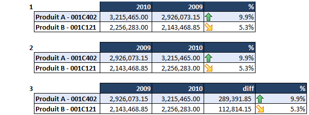
The major distinction between the 1st and the 2nd examples is the chronological order in which the data is presented. It is much easier to read a report showing data in chronological order.
In the first example the % of increase in sales doesn’t seem obvious because the numbers in the first column are higher than in the second one. The first thing that we observe is a decrease in sales, not an increase.
In the third example, it is easier to understand the % because the data used to calculate it (numerator and denominator) is shown. Without this information we would simply try to understand where the numbers came from instead of assessing a situation.
I admit it is not possible to perfectly understand tons of statistic data quickly; but I do believe that displaying it properly can increase the speed at which you will find important information and see the trends. Will be back to you soon with more useful tips!